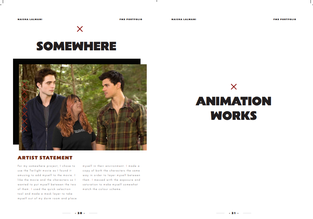
Portfolio


Artist Statement:

I tried my best to keep my portfolio as neat looking as possible and kept a colour scheme that is easy on the eyes; black, white and red. For the front and back cover I used pictures of Japan as they are aesthetically pleasing and related to me. I tried my best to separate my work and make it as big as possible so that it is able to be seen. I kept the artist statement/most of my text on separate pages. I made sure to organize the layout properly so that the texts weren't next to each other and made sure it was kept in order of when we did each assignment. My favourite page is the logo page where I formatted it to look like a professional brand guideline page and it took me very long to lay it out the way I wanted it to. If I had more time, I would try out some different fonts and make some pages more interesting, but overall I am very proud of what I made.


Comments

  1. I love your porfolio template that you used. All your projects are really impressive my favorite is your cat animation. I struggled the most with the animation and spent hours working on mine and it does not even compare to yours. Great work !

    ReplyDelete

Post a Comment

Popular posts from this blog

Photoshop Tutorials

  This video is cool when creating professional posters or wanting to go more into graphic design. I think creating the background and cleaning up the images is quite simple but the touch up on the images used takes practice to understand lighting and shading. The colour grading of the shapes and images is quite hard to understand when new to Photoshop. The positioning of everything and the choice of typography can be tricky too when matching a poster subject to the aesthetic needed. The tools itself are not hard to use as it was mostly transforming the images and a lot of it is similar to what we did in Illustrator. I think this video is fun to use when creating art from already existing images, as photo manipulation is a cool concept to understand when learning photoshop. Working on the compositing is quite simple to do as it is just editing already existing images from the internet and just fixing the levels of black and white on the images to create a mood/tone of the piece. Us...

Illustrator Tutorials

I think using the pen tool is easy to use overall but when you need to get into really detailed pieces, it will get hard to get the correct curves and shapes created with the tool, and it needs a lot of practice to get used to. In the video, the pen tool was used to create different kinds of curves and eventually covered digital lettering. I think that would be hard if the pen tool is not practiced enough. Creating letters and fonts would be quite interesting for me as a graphic designer so I would like to learn that even though it looks hard to master. I think using the blur and glass effects would be good to learn for UI/UX design or just to know because it is a cool effect. The blur effect seems easier to do than the glass effect, but I would like to do both to understand more things in Illustrator and learn how to do more. I think the glass effect is harder as there are more steps to follow and remember. I think this video is very good because it goes step by step clearly and is no...