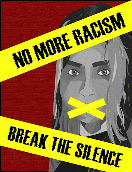
Final Image of my Poster:
Self Portrait:

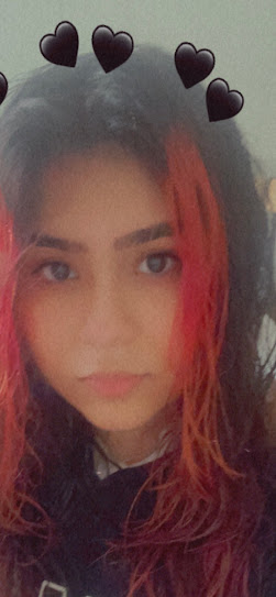
Selfie Inspiration:
Propaganda Inspiration:


 \
\
Artist Statement:
In this piece of work, I wanted to take a stand against racism using my graphic design skills to create a propaganda poster. As a person of colour in America, and as a victim of hate-crime in this country, I wanted to explain my feelings through my use of colour and representation of myself in the poster. I chose the colours red, greyscale and yellow to somewhat take inspiration from the constructivism art movement. I chose yellow to represent the tape and typography banners because I wanted it to give the effect of a crime scene.
In Illustrator, I created my self-portrait using the pen tool and shading with different colours. I did not want to include too many colours in my poster so I exported my portrait into Photoshop and applied a black and white filter as well as changed the brightness and contrast of my image to make it greyscale but not muted looking. Then, I took that image back into Illustrator and gave it a grain effect. For the typography, I chose a font that kind of looks like police tape lettering and applied an effect to it to make it not as bold and gave it more personality. I took inspiration from different propaganda posters (modern as well as older ones) to come up with the idea of covering my mouth with tape and the message I wanted to portray. This poster was my way of standing up to racism.
That artwork truly amazed me. I love how the message is so powerful and it is so important as well. I loved how you went back and connected it to constructivism movement. This shows a lot of depth.
ReplyDelete